Monday, March 28, 2016

Week11- Game box Re-Design

Concept: The goal was to use the constructive criticism from the critique to make the game box better.
Composition: The changes that were suggested were incorporating some the theme onto the bottom of the box, Making the logo and company more legible, and changing the cape on the character to clearly identify it. I decided that instead of having the villain behind the title that I would have it on the bottom of the box in a form of a constellation.
Thursday, March 17, 2016
My Game Board Box and Game Board Box Critique

Craft: The game box designs were made using Adobe Illustrator.The box was very simple in that I transferred aspects of the game board design to the box, such as the superhero, the planet, villain, and the text.
Concept: The goal of the project was to create a box design that conveyed what the game is about and what audience the game is created for.
Composition: The composition was the most important in designing the game's box. We discussed that key components such as the number of players, title, age, and illustrations were key in making a box for a game. I included the most important aspects of my game on the box to convey the outer space setting with the hero being the main character as the theme of the game.
Concept: The goal of the project was to create a box design that conveyed what the game is about and what audience the game is created for.
Composition: The composition was the most important in designing the game's box. We discussed that key components such as the number of players, title, age, and illustrations were key in making a box for a game. I included the most important aspects of my game on the box to convey the outer space setting with the hero being the main character as the theme of the game.
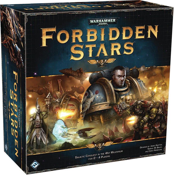 |
The reason I picked this game box is because I like how the color scheme works together in an appealing way. The complementary colors help both the background and text stand out in a dynamic way. |
 |
| I like how the image demonstrates how the games is played. The side-ways arrangement of the text also conveys that the game will be hectic. |
 |
| Both the design of the title and the image convey the chaos of war like the title suggests. |
 |
| This Star Trek board game box design gives me an idea of how I might want to design my game since both have outer space themes. |
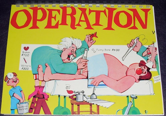 |
| The uniform color scheme is appealing. |
 |
| This box is well constructed in that it shows each character in the game while also capturing the attention of the consumer by the action-packed illustration centered on the box. |
 |
| The color scheme is the most appealing which includes a lot of vibrant, playful colors like pinks and blues. I also like how the image portrays a candy kingdom where the setting where the game takes place. |
 | |
| I like how the text is big and bold enough to draw the viewer's eye. I also like how the illustration gives a CLUE (no pun intended :)) concerning what the game will be about. Definitely has this old-timey, "who dun nit?" movie feel where the butler is always found guilty. |
 |
| I think the text gives the consumer the theme of the game which conveys an eerie, horror feeling. The illustration is also eye-catching being that there is action between the characters. |
 |
| What I liked about this gameboard is that it displays the actual gameplay, giving the consumer something to look forward to when purchasing. |
Friday, March 4, 2016
Week 9: Game Board Box
Craft: The game box designs were made using Adobe Illustrator.The box was very simple in that I transferred aspects of the gameboard design to the box, such as the superhero, the planet, villain, and the text.
Concept: The goal of the project was to create a box design that conveyed what the game is about and what audience the game is created for.
Composition: The composition was the most important in designing the game's box. We discussed that key components such as the number of players, title, age, and illustrations were key in making a box for a game. I included the most important aspects of my game on the box to convey the outer space setting with the hero being the main character as the theme of the game.
Concept: The goal of the project was to create a box design that conveyed what the game is about and what audience the game is created for.
Composition: The composition was the most important in designing the game's box. We discussed that key components such as the number of players, title, age, and illustrations were key in making a box for a game. I included the most important aspects of my game on the box to convey the outer space setting with the hero being the main character as the theme of the game.
Week 8: Game Board Pieces

Craft: Both the game piece designs were made using Adobe Illustrator. I first decided what type of symbols would be good to represent the game as game pieces. Since the setting takes place in outer space, I though space related pieces would be the most logical. For my three game pieces, I chose a planet, star, and a piece shaped like the hero of the game, I started out with the planet. I researched online to see if there were existing game pieces in this design. After finding one, I traced it in Adobe Illustrator using the pen tool, then colored each aspect of the design such as the globe, ring, and the base of the design. The other pieces were made by simply copying and pasting other tracings I previously made.
Concept: The goal of the project was to create game pieces that related to the game created in a logical way.
Composition: The composition was quite simple being that the figure or symbol had to be centered on the base of the game piece. using the Shape Builder Tool was useful in merging separate components together, such as the star, post, and base of the piece.
Thursday, February 25, 2016
Special Edition Blog: Edyta Stepien's "Non-Phenomena"


This exhibition consisted of large-scale video projections on the walls of SXU's Art Gallery. When I first stepped in, there was a striking impact as if I had been transported to an entirely different environment, Stepien opened her presentation by allowing the viewers to ask her questions about her piece. The first topic of concern was how the piece was made. She stated that the video clips were taken by pointing a micro-lens camera at a fish tank filled with water, with natural substances such as plants and sand while also including man-made objects such as wire, glitter, and bits of paper. To create a tumultuous atmosphere in this small setting, she created ripples in the water with a blow dryer and moving the water physically to created a disturbance into the items in the tank. The sound was also a component in this multimedia exhibit. Stepien stated that the sounds came from field recordings of pitches from hurricanes and storms.
Another topic was what she wanted to communicate with this piece. Stepien's inspiration for this piece came from the catastrophe of Hurricane Katrina. Stepien stated that she wanted to explore the relationship between the natural and mechanical by making this simulation of a violent storm that transported us as the viewers to the center of the chaos. She explored how even natural objects have man-made components.I believe that this was successful in the way the entire gallery space was transformed to envelop the viewer in constant motion and dimness.
This exhibition is different from any other exhibition I have attended in that it made me pay attention to both space and sound. I enjoyed how more than one sense was required to interpret what was happening in the composition. Even though I knew I was inside of a building, the walls no longer felt like walls because of the depth and scale of the projection. While my eyes were visually interested, my ears were audibly interested in the ominous sounds of wind whistling and high pitched, resonating bells that provoked a certain emptiness or muffled sound as if I really was underwater, immersed in chaos.
Monday, February 22, 2016
Week 5:Game Board Draft

Concept: The object of the game is to guide the hero "Super Fatty" through a location in space to safety. On his road to safety, there are both power-ups to guide him along and traps set by an evil villain.
Composition: I chose colors that would work well together based off of early, 8-bit style or game graphics. The color yellow played an important role in straightforwardly letting the player know when a power-up or trap has been landed on.
Subscribe to:
Posts (Atom)