This post discusses both the game box I designed for my board game and also 10 game box designs I think does a great job with the use of color, text, theme, illustration, or any combination thereof.
Craft: The game box designs were made using Adobe Illustrator.The box was very simple in that I transferred aspects of the game board design to the box, such as the superhero, the planet, villain, and the text.
Concept: The goal of the project was to create a box design that conveyed what the game is about and what audience the game is created for.
Composition: The composition was the most important in designing the game's box. We discussed that key components such as the number of players, title, age, and illustrations were key in making a box for a game. I included the most important aspects of my game on the box to convey the outer space setting with the hero being the main character as the theme of the game.
|
The reason I picked this game box is because I like how the color scheme works together in an appealing way. The complementary colors help both the background and text stand out in a dynamic way. |
 |
| I like how the image demonstrates how the games is played. The side-ways arrangement of the text also conveys that the game will be hectic. |
 |
| Both the design of the title and the image convey the chaos of war like the title suggests. |
 |
| This Star Trek board game box design gives me an idea of how I might want to design my game since both have outer space themes. |
 |
| The uniform color scheme is appealing. |
 |
| This box is well constructed in that it shows each character in the game while also capturing the attention of the consumer by the action-packed illustration centered on the box. |
 |
| The color scheme is the most appealing which includes a lot of vibrant, playful colors like pinks and blues. I also like how the image portrays a candy kingdom where the setting where the game takes place. |
 |
| I like how the text is big and bold enough to draw the viewer's eye. I also like how the illustration gives a CLUE (no pun intended :)) concerning what the game will be about. Definitely has this old-timey, "who dun nit?" movie feel where the butler is always found guilty. |
|
 |
| I think the text gives the consumer the theme of the game which conveys an eerie, horror feeling. The illustration is also eye-catching being that there is action between the characters. |
 |
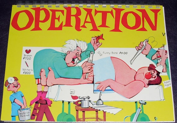
| What I liked about this gameboard is that it displays the actual gameplay, giving the consumer something to look forward to when purchasing. |


No comments:
Post a Comment